
The influence of Jenson on the design of romans
Evidence tells us that all the roman lowercase letters to this day have been designed on the same framework as Jenson’s
I have never used Adobe Jenson, which is very close to Jenson’s original design, because I have never liked Jenson as a type. I have always found it too wide and too sugary; it bores me and I hate that flamboyant e. Moreover, the little we know about Jenson as a human being does not induce me to appreciate the guy. The large amount of money he left to religious confraternities makes me suspect he had a lot to ask forgiveness for.
Nevertheless, these comments make little sense from a historical point of view. Because if you investigate Renaissance type you cannot help bumping into Jenson again and again, especially into his lowercase letters.
Last year, in Nicolas Jenson and the success of his roman type, I introduced the man, I took a close look at his roman, known as 115R in bibliographical databases, and I discussed its spread to about 40 printing offices before 1500. Analysing the Castaldi mutation (i.e. Jenson’s roman with some changes in the lowercase letters) I showed how Jenson chose certain models for his lowercase that became standard for roman type in the following centuries.
This point was not stressed enough. So I’ve decided to write this new article, where I intend to show some evidence of the influence of Jenson’s roman on later punchcutters not to mention its influence on the whole design of roman types up to the present.

Jenson established the model for lowercase
But first, let me make this point: Jenson’s main contribution to roman type concerns lowercase letters.
His capitals did not enjoy the same popularity. The development of capitals in roman type followed a certain path, towards inscriptional shapes, while Jenson’s capitals display shapes (especially M and R) with origins that are likely to be found in Carolingian manuscript revivals rather than in imperial inscriptions. Punchcutters probably had a wider variety of sources of inspiration for capitals than they did for lowercase letters — not just existing type, but also inscriptions, illuminations and perhaps also painted signs on wood or other material more perishable than stone that has not survived. Thus in the following decades they were able to get closer to the letterforms of imperial inscriptions than Jenson did with his roman.

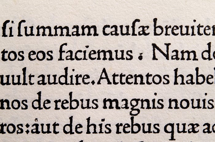
While cutting the lowercase, after the pioneer years of the early 1470s punchcutters stuck close to Jenson’s roman. Jenson defined what was to become a standard for the general widths and the relative proportions of the elements within the letters, the design of details like serifs and terminals and, above all, the design of certain letters — most notably a, g and h — that were significantly different from Spira’s and the other romans that appeared in the early 1470s. Jenson’s letters became the models for roman type, to the point that today we are entirely accustomed to them, and it is hard to appreciate the significance of Jenson’s work. At his first attempt Jenson designed a model for roman type that was consolidated and became a prototype for all subsequent romans up to this day. We can understand the scale of his contribution by comparing a few key letters of his roman with the earliest known types cut in Venice during the years 1469–1472, as shown below.

Most other types display letterforms that would hardly be acceptable today. Contrary to Jenson’s roman, if after five centuries we were to use digital versions of these archaic types in our present-day documents, we would certainly find some of their letterforms tricky reading.
Di Pietro 114R, a close imitation of Jenson’s roman
As we saw in the previous article, Jenson was famous. He was acclaimed as a businessman and for the quality of his type. His roman was soon copied and it was in 1472 that the press of Gabriele di Pietro (probably from Treviso) came out with the first imitation. Gabriele was one of the first Italians to open a printing office in Venice and from 1472–1478 he printed about 40 editions. He employed a roman type labelled di Pietro 114R that shares such strong similarities with Jenson’s roman in all of its sorts that it can easily be confused with it when observed with the naked eye.

Comparing the two types reveals that di Pietro 114R is a close imitation of Jenson. All the capitals and some lowercase letters display structural differences, however small, that point to this conclusion, despite some ambiguity with lowercase letters like i, l, m, n, o and others which, in any case, are unsuitable for type analysis because of their simplicity of construction.[1]
The differences are clear in the capitals only because we greatly enlarge the original marks on paper. Each of di Pietro’s letters follow Jenson’s design but occasionally some strokes are placed in a slightly different position. The differences are in the order of one or two tenths of a millimetre and it is almost impossible to spot them with the naked eye.

However, although they can be very small, the differences are there and they are structural. For instance the upper counter of di Pietro’s B seems smaller because of the way the upper bowl connects with the lower one. With letter M the difference is less subtle, the enlargements show how di Pietro’s M is wider than Jenson’s and there can be no doubt about a change in structure: this M does not derive from a punch of Jenson’s. The same structural difference is found in capital R: di Pietro’s R has a smaller bowl with a flatter top and its tail is shorter and notably lighter than Jenson’s. On a printed page di Pietro’s capital R looks like Jenson’s R with a light tail.
Di Pietro’s roman is a deliberate imitation
Di Pietro’s roman appeared in 1472, two years after the first appearance of Jenson’s roman which, as we saw in the previous article, was the object of intense trade. If Gabriele di Pietro had wished to employ Jenson’s type he should have been able to purchase it, as other printers did during the same years. My hypothesis here is that di Pietro bought a brand new type cut by a punchcutter who intentionally took Jenson’s roman as a model for his letterforms.
It seems that imitating an existing type was not uncommon among the early punchcutters. There were other types cut as close imitations of type already on the market in 15th-century Venice and I have found at least another three examples that appeared in the Venetian territories in the 1470s.[2] A reason for imitation is not difficult to surmise: in the 1470s type design was still in its infancy, and although goldsmiths were used to cutting punches with letters or other marks on them, their experience did not extend so far as cutting an entire alphabet. Imitating a successful type already on the market was a short cut to achieving a good product.
A hypothesis on how close imitations of existing types were cut
How could a 15th-century punchcutter achieve such close imitations of existing types? There is no historical reference to this practice and no document that mentions it is known. Moreover, the publications of the following centuries that describe typefounding — Moxon and Fournier — do not deal with the imitation of existing types, even though some related matters are discussed.[3] Given our current knowledge it seems likely that imitations were carried out by applying the technique of copying an existing type by means of smoke proofs. This technique survived well into the 20th century, and is still employed today by Nelly Gable at the Imprimerie Nationale.[4] Indeed, to achieve such a faithful imitation in such a small size (Jenson’s capitals are smaller than four millimetres) a reliable image of the original letterform must have been transferred to the top of a blank punch before cutting.

But there is no evidence that smoke proofs (for making temporary impressions to evaluate the progress of cutting punches) was a technique that was known in the 15th century. Although Hendrik Vervliet claims that the technique must have been known much earlier,[5] the earliest known mention of smoke proofs comes from Jacques Jaugeon’s report on punchcutting and typefounding in the Description des Arts et Métiers, completed in 1704.[6]
A note on the shape of di Pietro’s h in his 1481 ‘Britannicus’
But before moving on I want to mention another matter regarding Gabriele, because it reveals — once again — that Nicolas Jenson chose models for his letterforms which were not appreciated by his peers although they were later to become customary in roman type.

In 1478 Gabriele left Venice and moved, with his type, to Toscolano on Lake Garda, perhaps to escape from the plague that hit Venice that year. Toscolano was notable for its paper mills and Gabriele lived there for two years and printed four or five editions before moving to Brescia.[7] In Brescia in 1481 he printed what is the last known appearance of his di Pietro 114R, in Britannicus’s commentary of Persius’s Satires.[8] In this book Gabriele replaced the original straight h with a round h, apparently made of b with the lower arch filed off. Someone concerned with this work (the backer/publisher, the curator of the text or perhaps the author himself) may not have approved Jenson’s shape of h and requested its replacement with a round h, which was the most common shape of h at the time.

Loose imitations of Jenson’s roman
Besides di Pietro 114R other imitations of Jenson’s roman are found in Venetian incunabula, and some of them must have had considerable success, given the many printing offices in which they were employed. They were all loose imitations, where the punchctutter took inspiration from Jenson’s lowercase letters, and this is particularly clear if we check the shapes of a, g and h. Unlike di Pietro, none of them can be confused with Jenson when observed with the naked eye. I have found a dozen types in use in 15th-century Venice that fall into this category. This is a small number compared with the total number of distinct romans appearing in Venetian incunabula (each coming from a distinct set of punches) that according to my research should amount to about 60. But despite the small number, the majority of them were among the most widespread types of the time, each included in the stock of type of 20, 30 or more presses.

The most striking case is what I call the Scotus roman (Scotus 106Rb), a type that remained on the market for about a century and was employed by more than a hundred presses in Italy and elsewhere in Europe. It was the ‘Helvetica of the Renaissance’ and it is probable that no type enjoyed such popularity before Garamond: several sets of matrices were used throughout the Continent, from Venice to Messina, from Rome to Paris, from Basel to Saragosa, Vienna, the Low Countries, and most of the Italian towns that had a printing office.
Another important loose imitation of Jenson was the roman type employed by Aldus Manutius, cut for his exclusive use by the punchcutter Francesco Griffo: Aldus 114R, the renowned De Aetna roman which appeared in 1496.[9]

Mardersteig’s attributions of types to Francesco Griffo
In his essays on the life and work of Griffo, the printer and historian Giovanni Mardersteig (1892–1977) attributed several romans to this mysterious punchcutter which appeared in Padua and Venice after the mid-1470s.[10] Mardersteig worked on his research between the 1930s and 60s but the technology available at the time was very different from what is used today. He relied on his memory, on a vast knowledge of letterforms and on a set of photographic reproductions that today would be labelled as amateur. He left his historical archive to a little public library in Verona;[11] the ‘Fondo Mardersteig’ includes reproductions of many incunabula, but they are almost always small-scale photographs and only one or two pages per book. It is far too little material for helping solve the complex questions that the study of 15th-century publishing often raises. Mardersteig attributed the types on the strength of a certain similarity in design, but he had access to limited information (he probably did not consult BMC and he died before ISTC was conceived). He did not realise that some of the types had already been used earlier than he claimed by printers he did not identify.
However, besides his well-known work for Aldus, some of the types attributed to Griffo are included in those shown above as loose imitations of Jenson’s roman. Mardersteig hypothesised that Griffo worked for the Gregoriis brothers in the 1480s — although there is no evidence whatsoever for this — and he also attributed to Griffo the type called Gregoriis 111R, which, contrarily, is Jenson’s roman in use at the Gregoriis’s printing office. Mardersteig did not realise that that type was cast in matrices struck from Jenson’s punches. However, what is relevant here is that he noted a strong design link between the Jenson and the De Aetna romans.

Comparing the De Aetna with Jenson’s roman
The De Aetna capitals are different from Jenson’s in as much as they adhere more closely to the imperial inscriptional models and, notably, are lower than the ascenders — which is one of the most significant of the De Aetna innovations. Several of the De Aetna capitals are very different from Jenson’s: M has inclined stems and upper serifs that do not extend to the inside — like the imperial roman M. Furthermore, sorts of the De Aetna M usually lack an upper right serif but we do not know whether or not this was a deliberate design decision. [12] Like the De Aetna M, R with its extended tail, narrow B, E and S all point to the imperial capitals more accurately than those of Jenson. Letter S is not just narrower, it is also tilted to the right (the same features are found in lowercase s) and unlike Jenson’s it lacks spurs on the serifs.
If differences between the capitals are substantial, turning to lowercase letters we find that Griffo’s type is deeply indebted to Jenson. The letters are slightly narrower (photographic enlargements reveal that the De Aetna letters are normally as wide as Jenson’s but their x-height is about two tenths of a millimetre bigger) though the general proportions of the letters — i.e. the ratio between the widths of different letters — are the same as Jenson’s. Finally there is a small difference in the colour: the De Aetna letters look slightly lighter, with higher contrast between thick and thin strokes, and with thin strokes and serifs which look thinner and more refined.


Given these differences, apart from e with a horizontal bar, all other lowercase letters follow Jenson’s design and there are no details that depart from his model. For instance, if we take the terminals on top of a, c, f, g and r we see that Griffo designed them differently from one another, exactly as Jenson did: in letters a and r the terminal looks abrupt, like a mark left by lifting a pen, in c and f it is a more regular drop-like terminal, while the ear of g is made with a straight stroke.

Another example can be seen in the treatment of b and q: these two details were designed in the same way by both Jenson and Griffo. While they both opted for a flat bottom in b, Griffo introduced a slight curve in order to reduce the density of black in that area, which is noticeable in Jenson’s b. Both romans have a spur on the top of q.

Moreover, if we focus on the De Aetna a and g we note that although the curves display different tensions, the overall design features (the angle of stress, the treatment of details, the design of the strokes that make up the letters) are the same as Jenson’s.


Some similarity of these two types was probably recognised by Simone Gabi –known as Bevilacqua, a nickname that means ‘drink water’ but which may suggest he was fond of wine – when he mixed Jenson’s lowercase with the capitals of De Aetna in one of his types. Bevilaqua was a prolific itinerant printer and the roman type I am referring to (Bevilaqua 112Rb) appears in six editions (four signed and two attributed) printed in 1499. Bevilaqua had access to some cast type of the De Aetna roman, probably discarded by Aldus, who around the same time replaced them with a new set, slightly smaller and closer to Roman imperial inscriptions for proportions and details. They became famous in the Hypnerotomachia Poliphili, one of the most acclaimed books of the Renaissance.[13]

The ‘Aldine fashion’ in Paris after 1530
According to Harry Carter, the De Aetna roman ‘was decisive in shaping the printer’s alphabet’ because of its extraordinary influence on the type design of the following centuries.[14] But such influence took some decades to materialise. Indeed the innovations introduced with the De Aetna roman (for instance e with a horizontal bar and the capitals lower than the ascenders) did not attract attention when the type appeared, because these details are not found in any roman used in subsequent years. Griffo himself discontinued such innovations when in 1513 he cut a new roman for Ottaviano Petrucci. [15]
To appreciate the influence of the De Aetna roman we have to move to Paris. There, in Autumn 1530, the press of Robert Estienne started printing books with three romans in a new ‘Aldine fashion’ which, as stressed by Vervliet, led European typography into ‘a new epoch’.[16] The types were of different sizes: a Gros-Canon (Two-line Double Pica, ca. 40 pt), a Saint-Augustin (English, 13 pt) and notably a Gros-Romain (Great Primer, 16.3 pt) which ‘became the standard for Roman type in the two centuries to follow’.[17] Initially assigned to a young Claude Garamond, they have been recently attributed by Vervliet to maître Constantin, a mysterious punchcutter about whom nothing is known.[18] Constantin followed Griffo’s design (thus ultimately Jenson’s design decisions) and developed it at different type sizes. If the legacy of De Aetna was not clear, he made an explicit tribute to it by cutting capital M without an upper right serif, as we can see in Griffo’s type.

The legacy of the De Aetna roman in French type design
These three romans were soon widely imitated by Parisian punchcutters — who also replicated M without an upper right serif. They are considered the foundation of French 16th-century romans which, through their best-known exponent, Claude Garamond, ‘remained in general use’ in most of Europe until the mid-18th century.[19]

In his Conspectus, Vervliet lists dozens of types cut between 1530–1550 based on the De Aetna model, and he places them in the group called ‘Bembo romans’, after Pietro Bembo, the author of De Aetna. After the late 1540s French punchcutters started cutting what Vervliet calls Old-face romans, a different ‘letter family’ (I would rather call it ‘letterform style’) from the Bembo romans where the only difference is that the former displays a capital M with both the upper serifs.[20] From Vervliet’s work we see that the praised French 16th-century romans, cut by Garamond, Haultin, Granjon and others, as much as the romans cut by Guyot and Tavernier in Antwerp, were based on the De Aetna model.[21]
It is well known that Stanley Morison pointed out the design debt of Garamond to the De Aetna roman in the 1920s.[22] But few know that before him the connection had already been made by the French punchcutter and printer Firmin Didot, who in his preface to Virgil’s Bucolics (Paris, 1806) maintained that ‘Garamond […] does nothing but copy, in various sizes, the roman of Fr. da Bologna [Griffo], and it was he who took all the credit. Fr. da Bologna’s roman, having served to print a small volume of little importance and a few lines of titles or prefaces, was soon forgotten’. The small volume is obviously the De Aetna.[23]

Conclusions
Thus, as we have seen, through the work of Griffo and French punchcutters like Garamond, Jenson’s design decisions in the lowercase letters became the basis of roman type for the following centuries. The only exception is e with a horizontal middle bar, introduced by Griffo. All the roman lowercase letters to this day have been designed on the same framework as Jenson’s. Though changes in design parameters have produced differences in proportions, thick and thin contrast, angle of stress and treatment of details, the basic structure, the skeleton, is still Jenson’s. Given how early this type was cut (1470, the second earliest-known roman) and how different it looks from the types cut in those years, it seems to me there are grounds for considering Jenson to be among the main contributors to the history of typography and Western culture.

Endnotes
1. In type analysis we need to focus on letterforms with complex structures such as a, e, g, B, G, M, R… These carry a large amount of morphological information, because they show an articulated structure or, in other words, they are made up of a relatively large number of assorted strokes.
2. I refer here to the type of Butzbach and Augusta 110R (Verona, 1471) that I studied during my research, which closely imitates Valdarfer 110R, the capitals of Valdezoccho 115R (which also imitate Valdarfer’s) and finally Manzolus 83R (Venice or Treviso, c. 1478) which looks like a replica of Blavis 88R. As usual, these names derive from the earliest known printer who used such type. There is no information whatsoever about the punchcutters who actually cut them.
3. In the chapter ‘Des vignettes’ of his Manuel Typographique (pp. 27–28, vol. 1 of the original French version), Pierre Simon Fournier explains how to produce a counter-flower (i.e. a flower that reproduces the design of another flower turned the opposite way). Having cut a flower, a thin coating of wax is applied on the top of a blank punch, and after being gently warmed up, the punch of the flower is stamped onto it to leave an impression on the wax. Such impression is the indication for the punchcutter, who then traces the outline on the blank punch, removes the wax and starts cutting. But this technique produces a punch that is the other way round compared with the original one, thus it is irrelevant to the present discussion. English translation of Pierre Simon Fournier Le Jeune, Manuel Typographique, translated by Harry Carter, introduction and notes by James Mosley (Darmstadt: Technische Hochschule, 1995), vol. 3, pp. 46–47.
4. The procedure is as follows: the punchcutter makes a smoke proof of the piece of type he wants to imitate, then he transfers the mark (i.e. the right-reading image of the letter) onto a blank punch, traces the outline with a sharp point and starts cutting. Today Nelly Gable uses cellophane film and light-sensitive material on the punch to transfer the image of the letter. She demonstrated this technique in a short film made for the Imprimerie Nationale: La mémoire vive de l’écrit (vol. 1 et 2). Le poinçon de l’euro. Atelier du Livre d’art et de l’Estampe, directed by Axel Nilson, produced by l’Imprimerie nationale (2006), 30 minutes.

5. Hendrik D.L. Vervliet, email communication to the author, 7 September 2018.
6. This manuscript document, kept at the Istitut de France, Paris (MS.2741) has not been fully transcribed yet, though transcriptions and translations of parts of it have been published by James Mosley over the years. See for instance Mosley, ‘Jaugeon’s account of the type mould from the text of the Description des arts and métiers, 1704’, PHS Journal 23 (2015), pp. 7–43. See also the Appendix ‘The Académie des Sciences and the Description of Arts and Métiers’, in Fournier Le Jeune, Manuel Typographique, pp. 387–398. Jaugeon’s manuscript is particularly valuable because — apart from Moxon, with which it has no connection — it is the earliest known detailed account of the making of printing types and it was ‘drawn directly from conversation with working punchcutters and typefounders’ (Mosley, ‘Jaugeon’s account’, p. 23).

7. Historians have suggested that difficult economic circumstances caused these removals, and indeed Di Pietro spent four months in prison in Toscolano for insolvency. See the entry ‘Gabriele di Pietro’ by Tiziana Plebani in Dizionario Biografico degli Italiani, vol. 51 (1998).
8. Johannes Britannicus, In Persii satiras commentarii. Brescia: Gabriele di Pietro and his son Paulus, 14 Nov. 1481 (ib01213000).
9. The earliest known appearance of this important type is in Petrus Bembus, De Aetna dialogus. Venice: Aldus Manutius, Romanus, Feb. 1495/96 (ib00304000). However, many of the De Aetna capitals were already used in the Greek type of the Lascaris Grammar printed the previous year: Constantinus Lascaris, Erotemata. Venice: Aldus Manutius, Romanus, 28 Feb. 1494/95; 8 Mar. 1495 (il00068000).
10. Giovanni Mardersteig, ‘Aldo Manuzio e i caratteri di Francesco Griffo da Bologna’ in Scritti di Giovanni Mardersteig sui caratteri e sulla tipografia (Milano: Il Polifilo, 1988), pp. 107–157 (originally published in Mardersteig (ed.), Studi di bibliografia e di storia in onore di Tammaro De Marinis. Firenze: Olschki, 1964). See also Mardersteig, ‘Osservazioni tipografiche sul Polifilo nelle edizioni del 1499 e 1545’, in the same volume at pp. 197–215 (originally published in Contributi alla storia del libro italiano. Miscellanea in onore di Lamberto Donati. Firenze: Olschki, 1969).
11. It is the Accademia di Agricoltura Scienze e Lettere, located in the splendid Erbisti palace in the centre of Verona.
12. The marks on paper left by the De Aetna M might be due to casting defects or breakage while striking the matrix. However, in his class on the history of type design at the University of Reading (running since the late 1960s) James Mosley often shows a picture he took in Ostia, near Rome, of an imperial inscription where capital M lacks an upper right serif.
13. Franciscus Columna, Hypnerotomachia Poliphili. Venice: Aldus Manutius, Romanus, for Leonardus Crassus, Dec. 1499 (ic00767000). Electronic facsimile by Bayerische Staatsbibliothek, München.
14. Harry Carter, A view of early typography up to about 1600. Reprinted with an introduction by James Mosley (London: Hyphen, 2002), p. 72.
15. The type is seen in Paulus von Middelburg, Paulina de recta Paschae celebratione. Fossombrone: Ottaviano Petrucci, 1513. This type has been attributed to Griffo on the grounds of notary documents which place him in Fossombrone in August 1512, when Petrucci was the only printer there. See Adamo Rossi, ‘L’ultima parola sulla questione del cognome di m. F. da Bologna…’, Atti e memorie della R. Deputazione di storia patria per le provincie di Romagna, 3, 1 (1883), pp. 413, 414. However, new research on Griffo is presently being carried out by Paolo Tinti and Chiara Reati within the project Griffo, the great gala of letters. So, we can expect more on this elusive punchcutter in the coming years.
16. Vervliet, The Palaeotypography of the French Renaissance (Leiden: Brill, 2008), p. 105.
17. Vervliet, The Palaeotypography, p. 116. The three types are displayed in Vervliet, French Renaissance printing type, a Conspectus (New Castle, Delaware, and London: Oak Knoll Press, The Bibliographical Society and The Printing Historical Society, 2010). The Gros-Canon is type no. 143, p. 220; the Saint-Augustin is no. 85, p. 157; the Gros-romain no. 106, p. 179.
18. Vervliet, Conspectus, p. 36.
19. Carter, A view of early typography, p. 87; see also p. 102.
20. Vervliet, Conspectus, p. 55.
21. Vervliet, Palaeotypography, p. 172.
22. After proposing the Poliphilus type as a model for Garamond, Morison corrected it with the De Aetna roman in 1925. See the supplementary paragraph in Stanley Morison, ‘The Poliphilus type’, Monotype Recorder, January–February (1925), pp. [3]–[4] and the reproduction of pages from De Aetna in pp. [5]–[6]. Quoted in James Mosley, ‘Garamond, Griffo and others: the price of celebrity’, Bibliologia, 1 (2006), p. 33.
23. ‘Garamond […], n’a fait que copier sur différents modules le caractere de Fr. de Bologne; et c’est lui qui en a retiré tout l’honneur, parce que le caractere romain de Fr. de Bologne, n’ayant servi qu’à imprimer un petit volume peu important, et quelques lignes de titres ou de préfaces, a été bientôt oublié.’ Quoted in Mosley, ‘Garamond, Griffo and others’, p. 18.

